
BBBS CIL
Brief
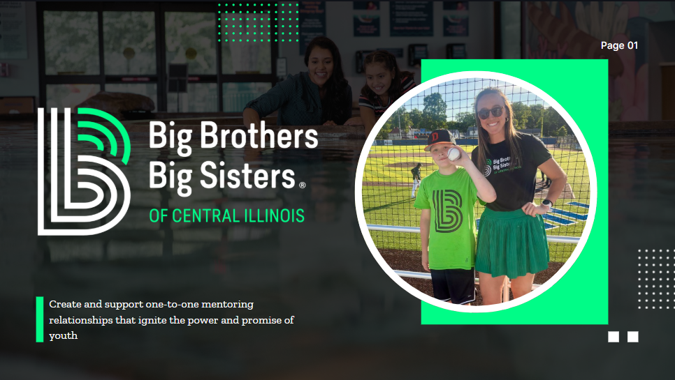
The objective was to lead a total digital migration and design overhaul for Big Brothers Big Sisters of Central Illinois (BBBSCIL) to enhance regional visibility and drive conversion pathways. The project required restructuring an outdated WordPress infrastructure into a sleek, accessible, and user-centric platform while modernising the agency's physical marketing footprint. Every touchpoint was engineered to align strictly with the bold, high-contrast global brand guidelines to build trust and accelerate community fundraising.
Role
Lead Designer | Web Developer | Technical Content Strategist
Tags
Web Development, Brand Identity, UI/UX
The Process
Phase 1: Full-Stack Web Redesign & Technical Migration The initial phase focused on transforming the agency’s online presence from an outdated legacy setup into a fast, accessible platform. I handled the backend technical logistics, including DNS architecture, secure domain routing, and data migration. To streamline donor conversion, I architected a minimal checkout flow integrating secure PayPal and Stripe payment gateways alongside user-optimised navigation blocks for core community programmes.
Phase 2: Content Strategy & Narrative Curation With the network infrastructure stable, I designed and populated new user pathways like "News & Stories" and "Match Activities." I curated localised copy—such as a St. Patrick’s Day Parade community recap—and configured a clean categorisation ecosystem using scannable excerpts and tags. This approach structuralised the site’s internal linking and ensured volunteers could easily track upcoming regional events.

Phase 3: Re-Engineering Digital Media Layouts Next, I focused on systemising the agency's promotional media to match the precise modern BBBS brand system. This involved designing high-contrast event graphics utilizing bold Electric Green (#00FC87) accents, rectangular grid constraints, and stark black structural fields. Complex multi-part regional graphics—such as the three separate dates for the 2026 Golf Fore! Kids’ Sake series—were compressed into a single, cohesive layout that immediately established visual hierarchy.

Phase 4: Typography and Print Material Optimisation The final phase translated the digital design language into physical print collateral. I engineered an official trifold brochure and fundraising flyers with strict typographic constraints, leveraging all-caps Steelfish headers for visual punctuation and clean Zilla Slab paragraph bodies. The designs integrated modernised community donation tiers and scannable QR codes, successfully bridging the physical-to-digital loop for in-person local campaigns.
The Results
The project delivered a unified, high-performance brand presence that vastly improved the professional presentation of BBBSCIL across Central Illinois. By resolving backend hosting vulnerabilities, deploying an intuitive responsive user interface, and standardising local event art, the agency was equipped with a robust framework built for higher volunteer retention and donor conversion. The final system underscores a proven capacity to handle full-scale digital product cycles and maintain absolute consistency across complex brand guidelines.